Got the delicious tomatoes from my neighborhood farmers market. They were just picked. My yard is too shady to grow anything. I used a color close to cerulean blue because it is the opposite of orange.
Thank you for viewing my art. Please click here to view pricing info.
These tiny little grapes are so sweet! But alas, champagne is not made from these grapes. But I couldn't resist putting in a glass of champagne. And the red ribbon goes along with the festivities!
Thank you for viewing my art! Please click here to view pricing info.
This little blue block was so happy to be in the painting! He is now with all his other block friends and telling them of his adventure and how he got to hang out with his big headed new friends. He is famous in his hood.
Thank you for viewing my art. Please click here for pricing info.
Polished my sugar bowl the other day so I thought I had better use it before it tarnishes again. I like the way the shadows hold the composition together.
I feel rusty every time I paint.... the solution is to paint more!! I have painted 3 this week and I pat my self on the back and say good for you. Then I go about my day and forget to post! I started with the plummets, thought they looked splendid in a yellow cup, but it needed more color. I think the cerulean blue sets everything off nicely.
Thank you for viewing my art. Please click here for pricing info.
Have you ever felt like you have too many things to do? I have been feeling like that lately. I just want to sit down and take a break.... maybe a tea break. I love these delicate china teacups that are rimmed in gold, they look so peaceful and calm.
I really need to paint more often and get back into painting daily so that I don't lose my skills! Thought I would try using primary colors to start. I used Quinacridone Red, Chinese Red, Thalo blue and Cadmium yellow light plus Titanium White.
While at Trader Joe's I spotted these miniature plums and just couldn't resist using them in a painting before I ate them all. They are just about two times larger than cherries. And delicious!
Thank you for viewing my art! Please click here for pricing information.
What I really like about this painting is that the focal point, the inside of the cup, is the sharpest area which makes the rest of the painting slightly out of focus. Just like when the object you are staring at is the end of the tunnel vision and every thing else is blurry. The difference is that with the painting you can stare at the blurry bits!!
I have been trying to paint more often like I used to but I end up overworking the paintings. I have not posted those paintings but have posted other painting I have done of recent. Today I decided to paint something simple and loose. I chose a jar of turmeric and paired it with a cool background. Hopefully I can carry this feeling forward into other paintings. Keeping my fingers crossed!
Sometimes on a cool morning I go walking in Louisville KY and that is where I came upon this alley in Crescent Hill where the sunrise was lighting up this building and fence. It makes me happy!
Thank you for viewing my art. Please click here for pricing information.
The reference picture for this painting is one that I took while in Venice about 10 years ago. I was experimenting with color and loosing details. I like the way it turned out. ;-D
Thank you for viewing my art. Click here for pricing information.
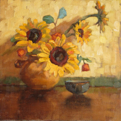
Sunflowers just make you smile! It is partly because of the sunny color, part because of the large dark center with the whimsical petals radiating out and because they have a mind of their own when it comes to arranging them in a vase!! Maybe I should put a smiley face in the middle of that big one...
This is painted on a larger canvas, 12" square, (the size of 4 - 6" square paintings)
All the cherries in the basket are leaving home and their family came to say good bye for the last time. They hired a vocalist to send them off with song.
These two Pals wanted me to paint a portrait of them and I said "I could with one condition, they had to sit still and not giggle!" And to my surprise they were perfectly behaved! This is larger than I usually paint but they wanted to be on a larger canvas, a 14 x 11. They look so quiet and innocent but are actually very demanding!
Guarding the Egg was difficult because the Fork did not know what danger to look for. Was the salt and pepper going to season it too much? Was the coffee going to get out of hand with too much caffeine? Maybe it was a danger you could not see.
The family is gathering for another celebration. There is Grandma, the matriarch with her daughter, son in-law and her two grandchildren. Then there is crazy cousin Eddie who is just in from the Himalayan mountains. He loves pink. Now who was supposed to bring the green bean casserole?
Experimenting with color and technique. The house was a light shade of orange so I used a double complementary scheme, orange/blue and yellow/purple. The colors I used were Thalo blue lake and a mixed orange( quinacridone magenta and Cad yellow pale) , with Cad yellow pale and ultramarine violet. I needed a violet mixture for the roof and foreground walkway shadows.
I am experimenting with something new. Trying to get away from hard edges and detail. the idea is to work with color, shape and feeling. This was done today while the model was posing. I did work on this a little while after the model left. I like the way the figure is outlined with the north facing window.
While the model was posing I thought she needed a red ball cap, so I painted one on. If life were only that easy. I painted this on a Senso panel that has a clear gesso coating so the linen shows. The only think I don't like about it is that the linen texture is not fine, but rather coarse. I like to have the drawing show some and this panel is good for that.
Today I tried something new... at least new to me. I painted this without sketching it in first and limited myself to one hour. I realized that when I sketch in first I end up getting very tight with the painting. So my not sketching in my painting is looser. I also used a limited palette, Titanium white, black, indanthrene blue, and quinacridone magenta, but did use some cad yellow light in the white to warm up the light on the surface.
I started this series of small (6” x 6”, 6” x 8”, 5” x 7”) paintings in May 2009 as a daily practice and discipline in order to liberate my work by painting from life in a restricted amount of time. In carefully considering placement, shape and color, I strive to find the essence and beauty of common objects in a fast-paced world that is dominated by electronic gadgets and digital images. It is my hope that people will stop, look and see the dignity and soul of things that are often taken for granted.
Composition and lighting are key elements in the creative design process, allowing me to create a lively and often humorous narrative.